

Icon
Reference for the Icon component, which puts an icon from Lucide, Font Awesome, Tabler or your media library inside text.
Overview
Use <Icon> to show an icon inside running text: a button readers look for on screen, a status mark in a table, or a logo in a link. The icon is as tall as the text around it, sits on its baseline, and takes its colour.
You can add an icon in two ways:
- Web Editor: Type
/iconand pick an icon. - Code Editor / MDX: Write
<Icon icon="rocket" />.
For an icon on a component, such as a Card or a Step, use that component's icon attribute instead. Every form an icon value can take is listed in Icons.
Using with Web Editor
Insert an icon
-
Place your cursor where the icon should go.
-
Type / and select Icon. The icon picker opens at the cursor.
-
Search by name or pick a style, then click an icon. To use your own file, open the Upload / URL tab.
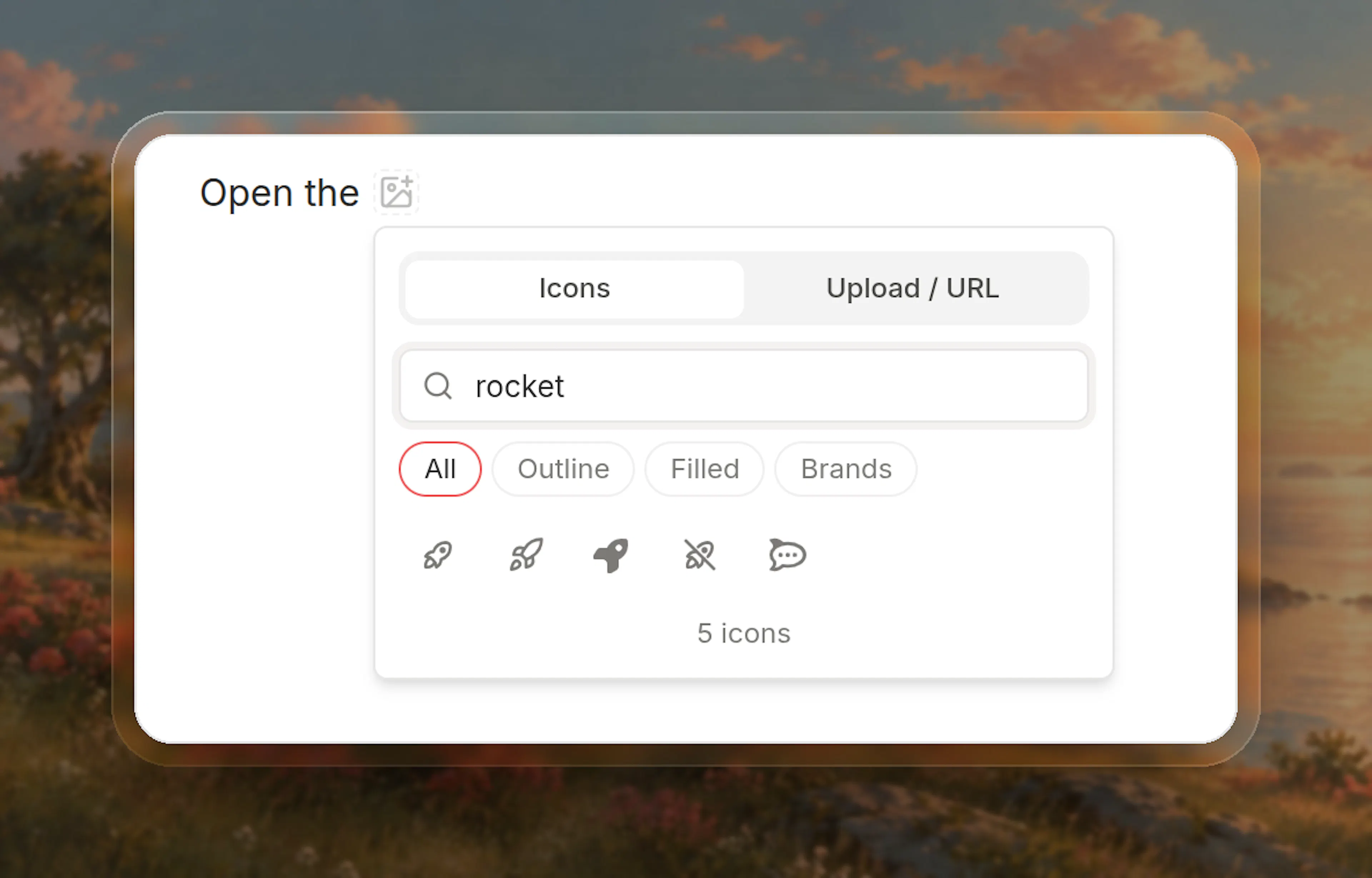
The icon appears at the cursor, and the cursor moves after it so you can keep typing.
Change or remove an icon
-
To change an icon, click it and pick another.
-
To remove an icon, hover it and click the × badge, or delete it like any character.
Prefer writing in code?
Switch to MDX view inside the Web Editor to set size or color, or to put an icon inside a link.
Using with Code Editor
Basic usage
Click the <Icon icon="settings" /> button to open settings.
Props
The icon: a name from your site's icon library, a name with its library such as fa-brands:github, or the address of an SVG, PNG or WebP file in your media library.
Width and height in pixels, such as "20". Without it, the icon is as tall as the text around it.
A hex value such as "#16a34a", a colour name, rgb() or hsl(), or a theme variable written var(--name). Without it, the icon takes the text colour. Any other value is ignored.
In headings, lists, tables and links
<Icon> works anywhere text does:
## <Icon icon="rocket" /> Get started

- <Icon icon="check" /> Single sign-on

| Plan | SSO |
| --- | --- |
| Pro | <Icon icon="check" /> |

Follow us on [<Icon icon="fa-brands:github" />](https://github.com/acme).
Advanced options
Specifications
-
Self-closing: Always write
<Icon ... />. It takes no children. -
Size: As tall as the surrounding text, including in headings, unless
sizeis set. -
Colour: Library icons and SVG files take the text colour, or
colorwhen it is set. PNG and WebP files keep their own colours. -
Headings: The table of contents and the heading's anchor ignore the icon.
-
Missing icons: A value no library draws, or a file outside your media library, shows nothing.
-
PDF export: Icons in text are included.