Update
Display changelog entries, version updates, and product announcements with labeled sections and timeline layouts.
Overview
The Update component creates clean, timeline-style blocks with a label on the left (date, version, or tag) and rich content on the right. It’s perfect for:
-
Release notes and changelog entries
-
Product or feature announcements
-
Version upgrade/deprecation notices
-
Roadmap milestones or status updates
You can use Updates in two ways:
-
Editor UI: Insert and edit Update blocks visually (no code needed).
-
MDX: Use the
<Update>component withlabel,description, andtagsprops.
Example: New features
We've added support for real-time collaboration and team workspaces.
-
Multi-user editing with live cursor tracking
-
Team workspace management
-
Enhanced permission controls
Using with Web Editor
Add an Update block
-
Place your cursor where you want the update.
-
Type / to open the Search and Add menu.
-
Search for Update and select it.
-
A new update is created with the current date as the label.
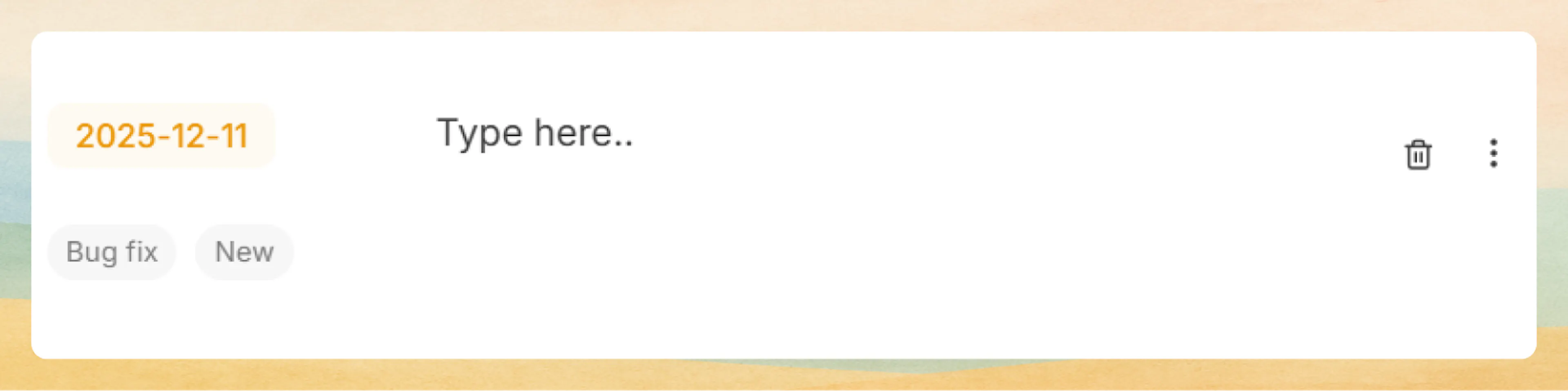
Write update content
-
Click in the content area to the right of the label (where it says Type here…).
-
Start writing your update.
-
You can add any rich content here:
-
Text, headings, bullet or numbered lists
-
Images, videos, tables, code blocks, callouts, cards, steps, tabs, etc.
-
Each Update block is just like a regular content section, styled as a changelog row.
Prefer writing in code?
You can switch to MDX view inside the Web Editor to write or edit this component using the same syntax as the Code Editor. This is useful if you want full control while staying in the Web Editor.
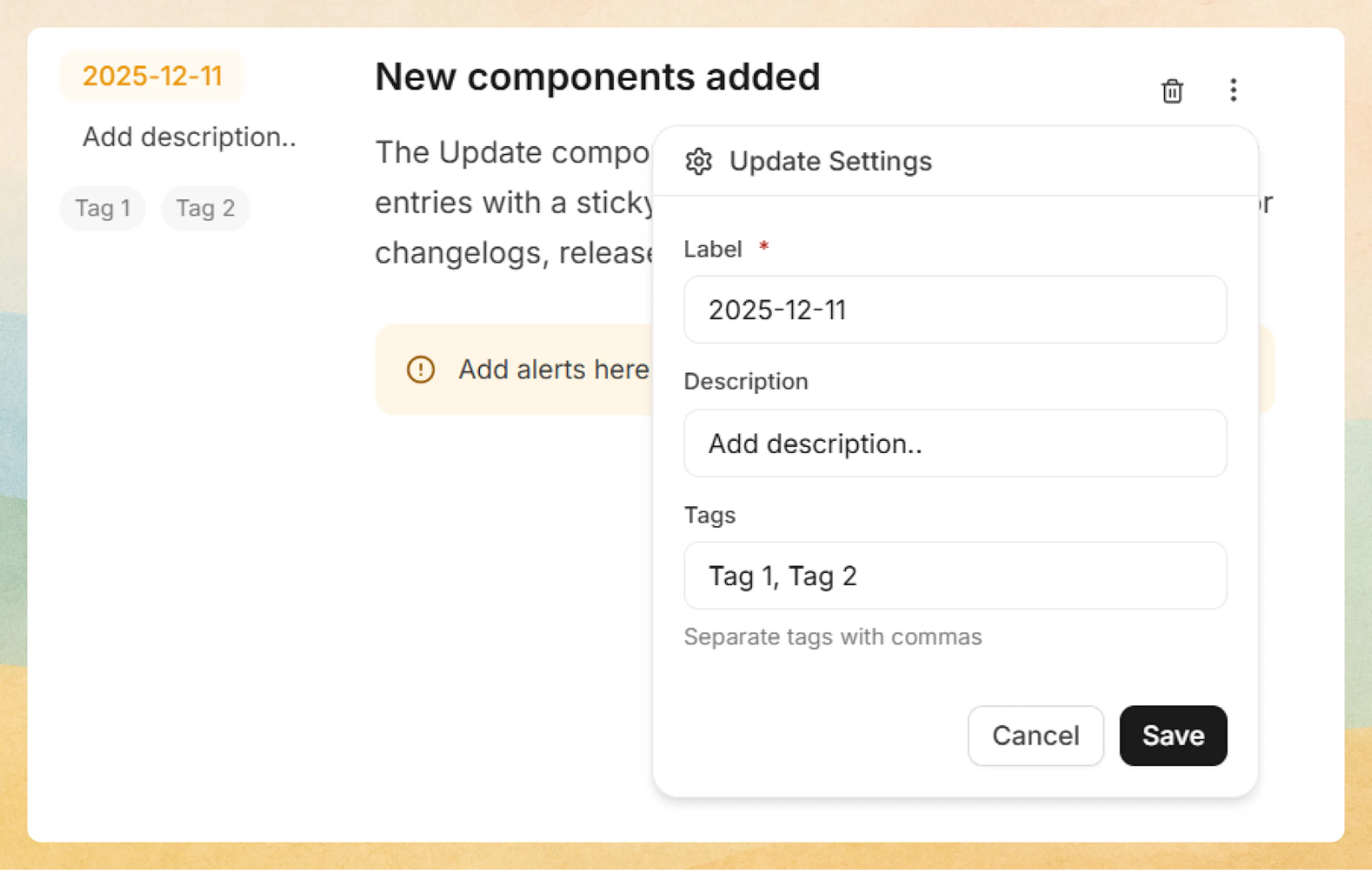
Edit label, description, and tags
-
On the right side of the Update block, click the three-dot menu.
-
The Update Settings panel opens with:
-
Label: The main tag shown on the left (for example,
2025-12-11orv2.3.0).- Keep a consistent format across updates (for product updates, dates usually work best).
-
Description: A short note shown under the label (for example,
New,Patch,v2.3.0, orPerformance improvements). -
Tags – Optional tags for each update. Type multiple tags separated by commas, e.g.
Bug fix, New.
Click Save to apply the changes.
Create a timeline of updates
-
Add multiple Update blocks, one after another, to build a changelog timeline.
-
Use labels (dates or versions) + tags (e.g.
New,Bug fix,Breaking) to help readers quickly scan what changed and when.
Using with Code Editor
Basic syntax
Use the <Update> component to create changelog entries with labels and descriptions:
<Update label="2024-10-15" description="v1.2.0">
  Released new analytics dashboard with real-time metrics and custom reporting.
</Update>
Released new analytics dashboard with real-time metrics and custom reporting.
Tags
Add optional tags to categorize and label updates:
<Update
  label="2024-10-20"
  description="v2.0.0"
  tags={["breaking", "security", "performance"]}
>
  ### Example: Major release

  This release includes breaking changes and performance improvements.

  - Updated API authentication flow requiring new credentials
  - Optimized database queries for 3x faster response times
  - Enhanced security with improved encryption standards
</Update>
Example: Major release
This release includes breaking changes and performance improvements.
-
Updated API authentication flow requiring new credentials
-
Optimized database queries for 3x faster response times
-
Enhanced security with improved encryption standards
Use tags to highlight update categories like "breaking", "feature", "bugfix", "security", or "deprecated".
Rich content
Updates support all MDX components including code blocks, images, cards, and other components:
<Update label="2024-10-18" description="Feature Launch" tags={["feature"]}>
  ### Example: API Playground

  Test API endpoints directly from documentation with our new interactive playground.

  <Columns cols={2}>
    <Card title="Try it now" icon="play-circle" href="/api-documentation-and-playground/interactive-playground-setup">
      Explore the playground with live examples
    </Card>
    <Card title="API Reference" icon="book-open" href="/api-documentation-and-playground/api-authentication">
      View complete endpoint documentation
    </Card>
  </Columns>

  <Callout kind="tip">
    The playground supports all authentication methods and provides instant response previews.
  </Callout>
</Update>
Example: API Playground
Test API endpoints directly from documentation with our new interactive playground.
Try it now
Explore the playground with live examples
API Reference
View complete endpoint documentation
The playground supports all authentication methods and provides instant response previews.
Sequential updates
Stack multiple updates to create a changelog timeline:
<Update label="2024-10-22" description="v2.1.1" tags={["bugfix"]}>
  - Fixed authentication token refresh issue
  - Improved error messages for API validation
  - Updated dependencies for security patches
</Update>

<Update label="2024-10-15" description="v2.1.0" tags={["feature"]}>
  - Added bulk export functionality
  - Implemented advanced search filters
  - Enhanced mobile responsive design
</Update>

<Update label="2024-10-01" description="v2.0.0" tags={["breaking", "feature"]}>
  - Complete UI redesign with modern interface
  - New team collaboration features
  - Performance improvements across all modules
</Update>
-
Fixed authentication token refresh issue
-
Improved error messages for API validation
-
Updated dependencies for security patches
-
Added bulk export functionality
-
Implemented advanced search filters
-
Enhanced mobile responsive design
-
Complete UI redesign with modern interface
-
New team collaboration features
-
Performance improvements across all modules
The sidebar uses sticky positioning on desktop to remain visible while scrolling through long updates.
Advanced options
Attributes
The primary label displayed in the sidebar. Typically used for dates (YYYY-MM-DD format) or version identifiers.
Supporting description displayed below the label. Commonly used for version numbers, release types, or brief categorizations.
The main content of the update. Supports all MDX content including headings, text, code blocks, images, cards, callouts, and other components.
Common patterns
-
Release changelog: Dates as labels, versions as descriptions, with tags like
feature,bugfix, andbreaking. -
Product announcements: Feature name or launch date as label, tags like
NeworImprovement. -
API changes: Version labels plus tags like
deprecated,security, ormigration. -
Security notices: Use tags such as
securityandcriticalfor quick scanning. -
Roadmap highlights: Milestones labeled by quarter or date, with tags such as
Planned,In progress,Released.
Combine Update blocks with Cards, Callouts, Steps, and Tabs to build rich changelog and announcement pages that are easy to scan and delightful to read.