Card
Reference for creating interactive cards with icons, images, and call-to-action buttons using both the editor UI and the Card component.
Overview
Cards let you create visually rich navigation and feature blocks with titles, descriptions, icons, images, and call-to-action (CTA) text.
Use cards when you want to:
-
Build navigation hubs that link to key areas like Getting Started, API Reference, or Support.
-
Create feature grids that highlight product capabilities with icons and short descriptions.
-
Surface resources such as GitHub, community, or external tools in a scannable layout.
-
Guide readers through structured flows, linking to tutorials or multi-step guides.
In the Documentation.AI component system:
-
<Card>defines a single interactive block. -
<Columns>arranges multiple cards into responsive grids. -
Cards often sit alongside:
-
Headings and Text for section structure.
-
Images when you want visual emphasis.
-
Columns when you need multi-column layouts.
-
Getting Started
Learn the fundamentals and get your project up and running in minutes.
API Reference
Explore the core authentication flows and API usage.
Using with Web Editor
You can add and configure cards visually in the Web Editor without writing MDX.
Insert a single card
-
Place your cursor on a new line.
-
Type / to open the component picker.
-
Select Card.
-
A new card appears with a default title and description.
Edit title and description
-
Title: Click the three-dot menu on the card, then update the Title field.
-
Description: Click the description text inside the card and type your own content. You can remove it entirely if you prefer a very compact card.
If you don’t want a description, click the placeholder and delete it.
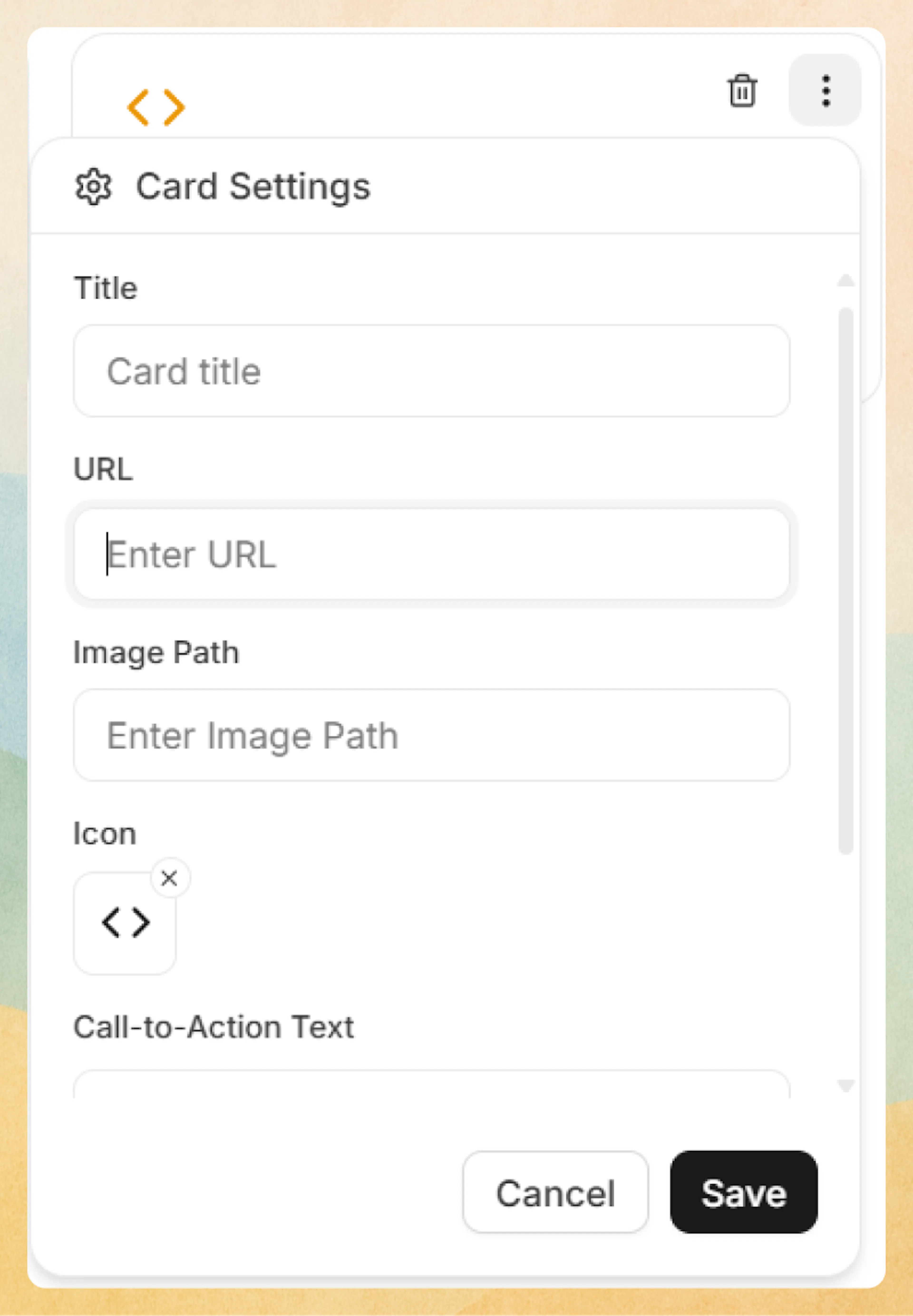
Configure card settings
-
Click the three-dot menu on the card.
-
In Card Settings, you can configure:
-
Title: Main heading shown at the top of the card.
-
URL: Link destination (internal path like
/getting-started/quickstartor an external URL). -
Image Path: Optional header image displayed above the card content.
-
Icon: Lucide icon name, chosen via Select Icon.
-
Call-to-Action Text: Optional CTA label such as “Learn more”.
-
Horizontal Layout: Toggle to switch between vertical (default) and side-by-side layout.
-
Link Target:
-
_self– Open in the same tab (default). -
_blank– Open in a new tab.
-
-
Prefer writing in code?
You can switch to MDX view inside the Web Editor to write or edit this component using the same syntax as the Code Editor. This is useful if you want full control while staying in the Web Editor.
Card groups in the Web Editor
Use Card Group to lay out multiple cards in columns without touching MDX.
-
Place your cursor on a new line.
-
Type / and select Card Group.
-
A group with two cards appears by default.
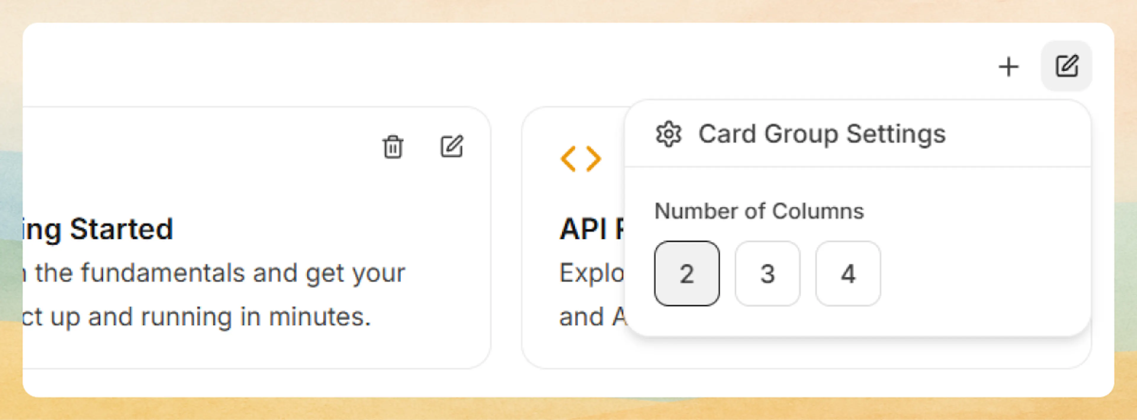
You can then:
-
Configure columns: Open Card Group Settings from the group’s three-dot menu and choose 2, 3, or 4 columns.
-
Add cards: Click the + icon next to the group’s menu.
-
Remove cards: Use the trash icon on any card.
-
Edit each card: Use each card’s three-dot menu to set its own title, URL, icon, image, CTA, and layout.
Using with Code Editor
Use the <Card> component directly when editing MDX in the Code Editor. This gives you full control over structure and reuse.
Single card
A minimal card with a title, icon, and link:
<Card title="Quickstart" icon="zap" href="/getting-started/quickstart">
  Get up and running with Documentation.AI in a few minutes.
</Card>
Rendered example:
Quickstart
Get up and running with Documentation.AI in a few minutes.
Small card grid with Columns
Combine <Card> with <Columns> for a responsive feature or navigation grid. See Columns for more layout details.
<Columns cols={3}>
  <Card title="Get started" icon="book-open" href="/getting-started/introduction">
    Learn the basics of your documentation project.
  </Card>
  <Card title="Write in the Web Editor" icon="monitor" href="/write-and-publish/web-editor">
    Edit content visually with rich components.
  </Card>
  <Card title="Write in code" icon="code" href="/write-and-publish/code-editor">
    Keep docs alongside your codebase using MDX.
  </Card>
</Columns>
Get started
Learn the basics of your documentation project.
Write in the Web Editor
Edit content visually with rich components.
Write in code
Keep docs alongside your codebase using MDX.
Horizontal layout
Use horizontal cards when you want a compact row-like treatment, for example in a resources section:
<Card
  title="GitHub Repository"
  icon="github"
  href="https://github.com/example/repo"
  cta="View on GitHub"
  horizontal={true}
>
  Explore the source code and contribute to the project.
</Card>
GitHub Repository
Explore the source code and contribute to the project.
Cards with images
Add an image to make a card stand out. For more image options, see Images.
<Card
  title="Deployment guide"
  icon="cloud"
  href="/deployment-and-hosting/deploy-your-documentation"
  image="https://example.com/deploy-guide-header.png"
>
  Follow step-by-step instructions to ship your docs.
</Card>

## Advanced options

Use these details when you need precise control over card appearance and behavior, or when you are standardizing card usage across your docs.

### Icons

Cards use [Lucide](https://lucide.dev/icons) icon names in the `icon` prop. Use the icon name only (no `Icon` suffix), for example:

```jsx
<Card title="Security" icon="shield" href="#security">
  Implement industry-standard security measures.
</Card>
Commonly used icon names include:
-
book-open,code,database,lock,users -
zap,cloud,terminal,settings -
shield,bar-chart,github,rocket
Security
Implement industry-standard security measures.
Performance
Optimize for speed and efficiency.
Analytics
Track metrics and user behavior.
Images
Use the image prop to render a header image above the card content:
-
Images display at full card width.
-
Prefer a consistent aspect ratio across a grid to avoid height jumps.
-
Host images in your project’s asset storage or a stable CDN.
<Card
  title="Database Management"
  icon="database"
  href="#database"
  image="https://example.com/database-header.png"
>
  Master schema design, migrations, and performance tuning.
</Card>
Targets and external links
Use target="_blank" for external destinations that should open in a new tab:
<Card
  title="Community Discord"
  icon="users"
  href="https://discord.gg/example"
  target="_blank"
  cta="Join now"
>
  Connect with other users, ask questions, and share feedback.
</Card>
If you omit target, cards default to _self (same tab), which is recommended for internal docs navigation.
Layout: horizontal vs vertical
Control card orientation with the horizontal prop:
-
horizontal={false}(default): Icon and content stacked vertically. -
horizontal={true}: Icon and text arranged side by side.
Horizontal cards work best when:
-
The description is short (one or two lines).
-
You want a “list of resources” look rather than a grid.
<Card
  title="Support center"
  icon="help-circle"
  href="/help/contact-us"
  horizontal={true}
>
  Reach out to our team for assistance.
</Card>
Attribute reference
These attributes are available on the <Card> component.
Card heading text displayed prominently at the top.
Link destination URL. Can be relative (/getting-started/quickstart) or absolute (https://example.com).
Lucide icon name (without Icon suffix). Displays in the card header.
Header image URL displayed above card content at full width.
Call-to-action text displayed as a link-style button, typically at the bottom of the card.
Use horizontal layout with icon beside content (horizontal={true}) instead of stacked layout.
Link target: _self (same tab, default) or _blank (new tab).
Pair cards with Columns, Headings and Text, and Images to build clear, scannable sections that are easy to maintain in both the Web Editor and Code Editor.