Collection List
Reference for the CollectionList component that displays direct children of a navigation node as cards, accordions, lists, or links.
Overview
CollectionList renders the direct children of a navigation node in one of four layouts. Instead of manually listing links to child pages, you point the component at a navigation node and it automatically displays the children in the layout you choose.
Use CollectionList to:
-
Build landing pages that showcase everything inside a group, tab, or dropdown
-
Create hub pages for large sections so readers can scan and jump to the right topic
-
Keep navigation-driven content in sync automatically as you add or remove pages
You can add the component in two ways:
-
Web Editor – Insert from the slash menu under the Dynamic category.
-
Code Editor (MDX) – Use the
<CollectionList>component directly.
Collection components read your live navigation structure. When you add, remove, or reorder pages in a group, the collection updates automatically on your next deploy. Because they resolve against your actual navigation tree, they cannot be previewed as static examples on this page; add one to a page in your own project to see it in action.
Understanding the node attribute
The node attribute tells the component which navigation node's children to display.
The node value is a path that walks your navigation tree using the format type:name, separated by / for each level. For example:
| Node path | What it targets |
|---|---|
tabs:Guides | The tab named "Guides" |
tabs:API/groups:Authentication | The "Authentication" group inside the "API" tab |
groups:Getting Started | The group named "Getting Started" |
dropdowns:Platform/tabs:REST | The "REST" tab inside the "Platform" dropdown |
The component resolves the node at render time and displays its direct children.
In the Web Editor, you do not need to write the node path manually. The slash menu opens a visual navigation tree picker where you select the target node by clicking.
Layouts
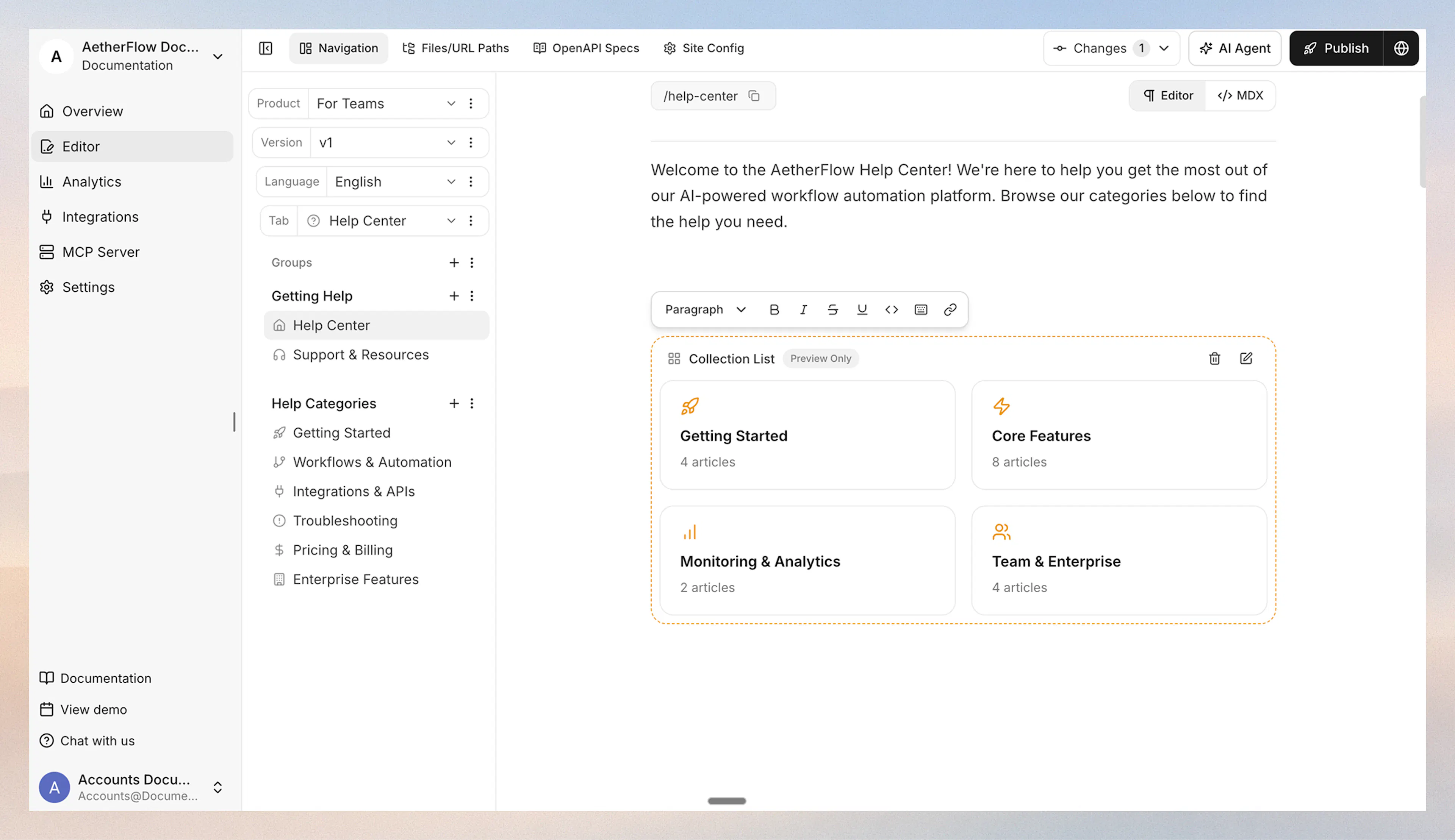
Displays children as a responsive grid of cards. Each card shows the child's name, icon, and a count of descendant pages.
<CollectionList node="tabs:Guides" layout="cards" cols={2} />
Use cards for landing pages and hub pages where visual browsing matters.
Displays children as a collapsible accordion. Each section header shows the child's name and expands to list its pages.
<CollectionList node="tabs:Guides" layout="accordion" default-open={true} />
Use accordion when you want a compact overview that readers can expand selectively.
Displays children as a simple bordered list with hover states and navigation arrows.
<CollectionList node="tabs:API" layout="list" />
Use list for clean, minimal navigation sections without visual clutter.
Displays children as plain inline links with minimal styling.
<CollectionList node="groups:Resources" layout="links" />
Use links when you want to embed a lightweight set of navigation links inside other content.
Card variants
When using the cards layout, you can choose a card style with the card-variant attribute:
-
default– Icon on the left, name and page count on the right. -
horizontal– Wider card with a horizontal layout. -
centered– Icon and text centered for a symmetrical look.
<CollectionList node="tabs:Guides" layout="cards" cols={3} card-variant="centered" />
Using with Web Editor
-
Place your cursor on a new line.
-
Type / and search for Collection List.
-
Select Collection List from the Dynamic category.
-
A navigation tree picker opens. Select the node whose children you want to display.
-
The component is inserted with default settings. Click the edit icon to adjust layout, columns, and card variant.
Prefer writing in code?
You can switch to MDX view inside the Web Editor to write or edit this component using the same syntax as the Code Editor. This is useful if you want full control while staying in the Web Editor.
Using with Code Editor
A minimal example with only the required attribute:
<CollectionList node="tabs:Guides" layout="cards" />
A full example showing all optional attributes (some apply only to specific layouts):
<CollectionList
  node="tabs:Guides"
  layout="cards"
  cols={2}
  card-variant="default"
/>
cols and card-variant only apply to the cards layout. default-open only applies to the accordion layout. Attributes that do not match the current layout are ignored.
Attribute reference
Navigation node path in type:name/type:name format. Identifies which node's children to display.
Display layout. Accepted values: "cards", "accordion", "list", "links". Defaults to "cards".
Number of grid columns for the cards layout. Accepted values: 1, 2, 3, 4. Defaults to 2. Ignored for other layouts.
Card display style for the cards layout. Accepted values: "default", "horizontal", "centered". Defaults to "default". Ignored for other layouts.
Whether the accordion starts expanded. Only applies to the accordion layout. Defaults to true.
Best practices
-
Point to container nodes, not pages Collection components display children of a container (group, tab, dropdown). Pointing to a leaf page produces an empty result.
-
Keep the target section well-organized Because collections mirror your navigation structure, a clean hierarchy of groups and pages produces a clean layout. Reorganize your navigation if the collection output looks cluttered.
-
Use CollectionList on landing pages Cards and accordion layouts work well as the primary content of a hub page that introduces a section and links readers to its children.
-
Combine with content pages on containers If your groups or tabs have content pages attached, you can use a CollectionList on that content page to create a self-maintaining hub.