Customize Colors and Typography
Fine-tune your documentation site's visual appearance by customizing brand colors, text colors, and typography for optimal readability and brand consistency.
Fine-tune your documentation site's visual appearance by customizing specific color elements and typography. This guide focuses on detailed color customization beyond basic theme setup to achieve perfect brand alignment.
These site-wide color settings work together with page-level front matter to create a cohesive brand experience across all documentation pages.
Prerequisites
-
Basic understanding of theme and color setup
-
Your brand color palette or style guide
-
Access to your
documentation.jsonfile -
Understanding of hex color codes and contrast ratios
Customize Colors from the Editor (recommended)
You can configure your brand, heading, and text colors directly from Site Config in the Editor without editing JSON.
Step 1: Open Theme Colors
-
In the Editor, click Site Config in the top toolbar.
-
Scroll down to the Theme Colors section.
All changes made here are stored under theme.colors in documentation.json and appear in the Changes panel. Publish your documentation to apply the changes.
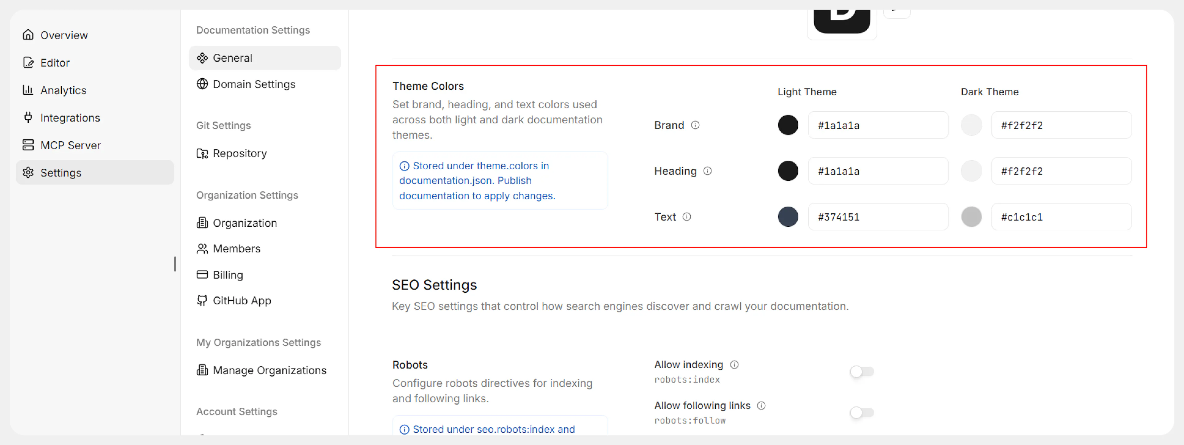
Step 2: Configure Light and Dark Theme Colors
In the Theme Colors section you’ll see two columns: Light Theme and Dark Theme. Each column lets you configure the same set of properties:
-
Brand
Sets your primary brand color for interactive elements such as call-to-action buttons, links, and selections. -
Heading
Defines the color used for headings and titles across your documentation. -
Text
Controls the main body text color for optimal readability.
Recommended usage:
-
Light Theme
-
Choose colors that work well on light backgrounds.
-
Ensure body text and headings have sufficient contrast against the page background.
-
-
Dark Theme
-
Use a lighter/brighter version of your brand color for interactive elements.
-
Pick heading and text colors with high contrast on dark backgrounds to maintain readability and avoid eye strain.
-
Use valid hex color codes (for example, #1a1a1a) and check that your combinations meet accessibility contrast requirements.
Step 3: Apply Changes
-
Review your selections for both light theme and dark theme.
-
Save your changes if prompted.
-
Publish your documentation so the updated colors appear on your live site.
If you need more granular or automated control, you can also configure these colors directly in documentation.json as described below.
Customize Brand Colors via Configuration File (Advanced)
Follow these steps if you prefer to manage colors through version-controlled configuration.
Step 1: Identify your color requirements
Gather your brand colors in hex format:
-
Primary brand color (for buttons, links, calls to action)
-
Text hierarchy colors (headings vs body text)
-
Ensure colors work for both light and dark backgrounds
Step 2: Configure light theme colors
In your documentation.json, customize the light theme colors:
{
  "colors": {
    "light": {
      "brand": "#3143e3",
      "heading": "#1a1a1a",
      "text": "#374151"
    }
  }
}
Configure each color property:
Set your primary brand color for interactive elements. Use hex format (e.g., #3143e3).
Choose a strong color for headings and titles. Default: #1a1a1a.
Select a readable color for body text. Ensure good contrast. Default: #374151.
Step 3: Configure dark theme colors
Add complementary colors for dark mode that maintain brand consistency:
{
  "colors": {
    "dark": {
      "brand": "#85a1ff",
      "heading": "#f2f2f2",
      "text": "#c1c1c1"
    }
  }
}
Dark theme considerations:
Use a lighter/brighter version of your brand color. Use hex format (e.g., #85a1ff).
Choose high contrast colors for readability in dark mode. Default: #f2f2f2.
Ensure sufficient contrast against dark backgrounds. Default: #c1c1c1.
Step 4: Test color combinations
-
Save your configuration
-
Deploy or preview your changes
-
Test both light and dark modes
-
Check text readability in various lighting conditions
-
Verify brand colors maintain visual hierarchy
Typography Best Practices
The Documentation.AI platform automatically handles typography optimization, but consider these guidelines when choosing colors:
Contrast Requirements
-
Maintain WCAG AA compliance (4.5:1 contrast ratio minimum)
-
Test colors with accessibility tools
-
Ensure readability for users with visual impairments
Brand Consistency
-
Use your brand's primary color for interactive elements
-
Maintain consistent color relationships between themes
-
Consider your brand's tone (professional, friendly, technical)
Visual Hierarchy
-
Make headings distinctly different from body text
-
Use your brand color strategically to guide user attention
-
Ensure navigation elements stand out appropriately
Advanced Color Customization
Step 5: Test across devices
-
View on different screen sizes (mobile, tablet, desktop)
-
Test in various lighting conditions
-
Check color accuracy across different displays
-
Verify accessibility with screen readers
Step 6: Document your color choices
Keep a record of your color decisions:
-
Brand color hex codes and their usage
-
Contrast ratio measurements
-
Any accessibility considerations
-
Brand guideline compliance notes
Verify Your Color Setup
-
Visual check: Compare with your brand guidelines
-
Contrast test: Use tools like WebAIM Contrast Checker
-
User testing: Get feedback on readability
-
Cross-browser testing: Ensure consistency across browsers
-
Accessibility audit: Test with screen readers and accessibility tools
Troubleshooting Common Issues
-
Low contrast: Darken light theme text or lighten dark theme text
-
Brand mismatch: Adjust colors to better match your style guide
-
Poor readability: Increase contrast between text and background colors
What's Next
Color customization is entirely optional. Documentation.AI provides carefully designed defaults that meet accessibility standards. Only customize colors if you need specific brand alignment or have particular visual requirements.