Images
Reference for adding images using the editor UI and the Image component.
Overview
Use images to illustrate concepts, show UI, and make your documentation easier to scan. Documentation.AI automatically optimizes images uploaded through the Web Editor and serves them from a CDN, so you get:
-
Fast, cached delivery for all uploaded images.
-
Responsive sizing with preserved aspect ratio.
-
Built-in support for accessibility via required
alttext.
You can add images in two ways:
-
Web Editor: Insert and manage images visually.
-
Code Editor / MDX: Use the
<Image>component with explicit props.
Images can also be combined with other layout components such as <Card> (via its image prop) and <Columns> to build richer page layouts.
Using with Web Editor
Use the Web Editor to insert and manage images without writing code. For more on the editor itself, see Web Editor.

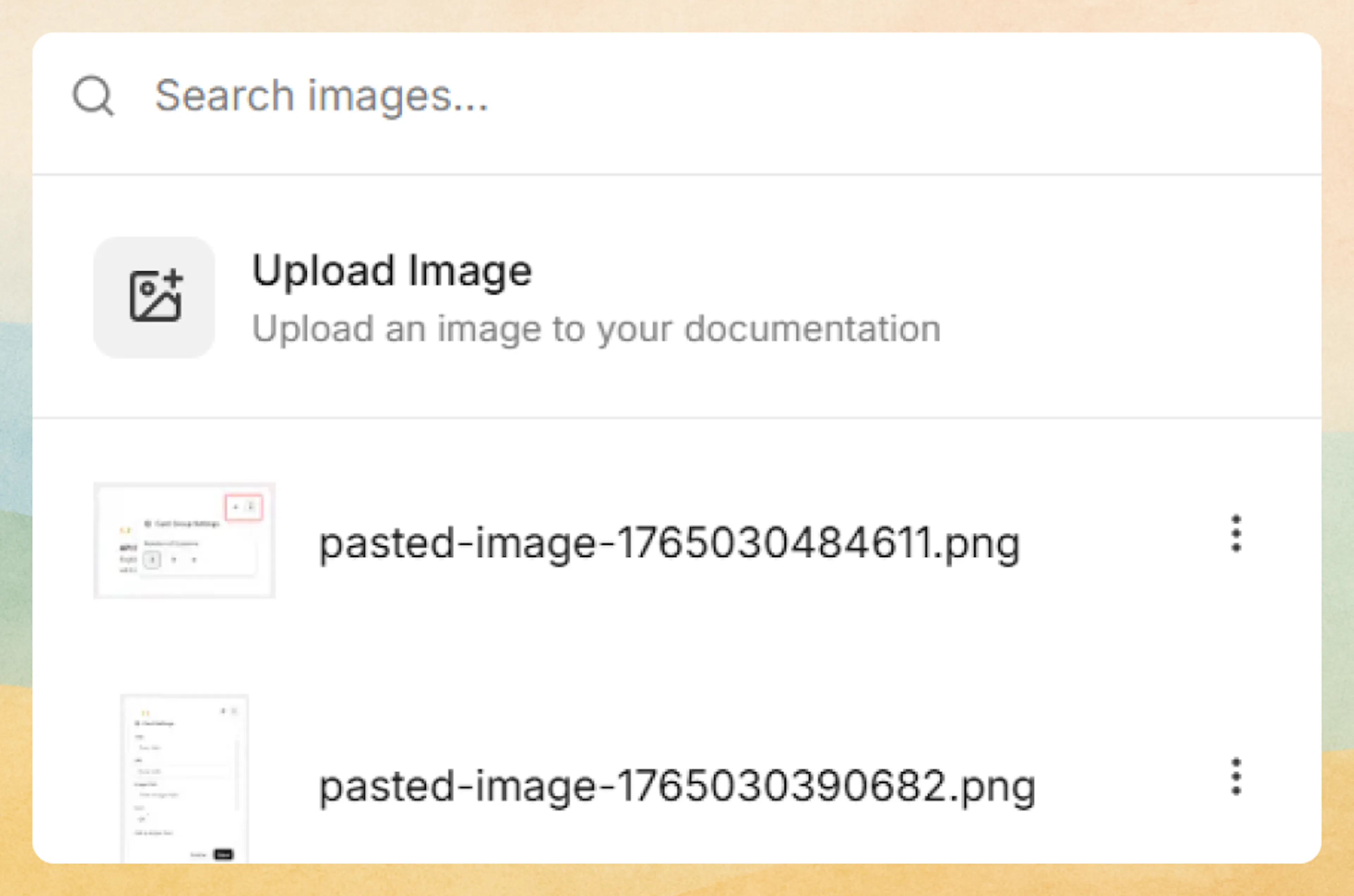
Insert an image
-
Place your cursor on a new line.
-
Type / to open the command menu.
-
Select Image.
-
In the picker that appears, either:
-
Click Upload image to choose a file from your computer, or
-
Select an already uploaded image from the list.
-
The selected image is inserted into the page and served from an optimized CDN.
Prefer writing in code?
You can switch to MDX view inside the Web Editor to write or edit this component using the same syntax as the Code Editor. This is useful if you want full control while staying in the Web Editor.
Resize, align, and manage the image
Hover over an image to reveal controls:
-
Top-left badge: Shows current image dimensions (width × height).
-
Side drag handles: Drag horizontally from the left or right edge to resize the width; height adjusts automatically to preserve aspect ratio.
-
Top-right toolbar:
-
Alignment icon: Align the image (for example, left, center, or right).
-
Zoom icon: Open the image in full size.
-
Trash icon: Remove the image from the page.
-
Edit image properties
-
Hover over the image and click the three-dot menu in the top-right corner.
-
In Image properties, you can update:
-
Image URL: The full CDN URL for the uploaded image.
-
Caption: Optional text displayed below the image.
-
Alt text: Required descriptive text for accessibility and SEO.
-
The alt text field is mandatory for SEO and accessibility. Describe what is in the image, not just the file name.
You can copy the image URL from image properties and reuse it in other components, such as <Card image="...">, <Columns>, or additional <Image> blocks.
Using with Code Editor
When editing pages as MDX (for example in the Code Editor), use the <Image> component to add images directly in code.
Basic usage
<Image
  src="https://your-cdn.com/image.png"
  alt="Description of the image"
  width="800"
  height="600"
/>
The alt attribute is required. Provide concise, descriptive text that explains the image content to screen readers.
Key props
Use these props to control how images render:
Absolute image URL. Prefer CDN URLs, including those copied from the Web Editor.
Descriptive text for accessibility and SEO. This is read by screen readers and shown when the image cannot load.
Image width in pixels. Helps optimize layout and prevent layout shift.
Image height in pixels. Used with width to reserve space and reduce layout shift.
Inline CSS styles for alignment, sizing, and positioning. Use for custom layout behavior.
Load the image immediately instead of lazy loading. Use for above-the-fold images only (default: false).
Browser loading priority: high, low, or auto. Use high for critical images such as hero banners.
Alignment and sizing example
<Image
  src="https://your-cdn.com/image.png"
  alt="Center aligned image"
  width="400"
  height="300"
  style="width: 400px; height: auto; margin: 0 auto;"
/>
You can combine <Image> with layout components like <Columns> or include an image in a <Card> via its image prop to create more complex grids and feature blocks.
Advanced options
Performance and loading behavior
Use priority and fetchpriority to fine-tune how critical images load:
<Image
  src="https://your-cdn.com/hero-image.png"
  alt="Hero banner showing product features"
  width="1200"
  height="600"
  priority={true}
  fetchpriority="high"
/>
Reserve performance options for above-the-fold or otherwise critical images. Overusing priority or fetchpriority="high" can hurt overall page performance.
External URLs
You can reference external images directly in MDX:
<Image
  src="https://external-cdn.com/image.jpg"
  alt="External image description"
  width="600"
  height="400"
/>
External images are not optimized by Documentation.AI's CDN. Whenever possible, upload images through the Web Editor and reuse their CDN URLs for better caching and performance.
Specifications
-
URL format: Only absolute URLs are supported.
-
Alt text: Required for all images (for accessibility and SEO).
-
Supported formats: JPEG, JPG, PNG, GIF, WebP, SVG, ICO.
-
CDN: Images uploaded via the Web Editor are automatically optimized and cached.