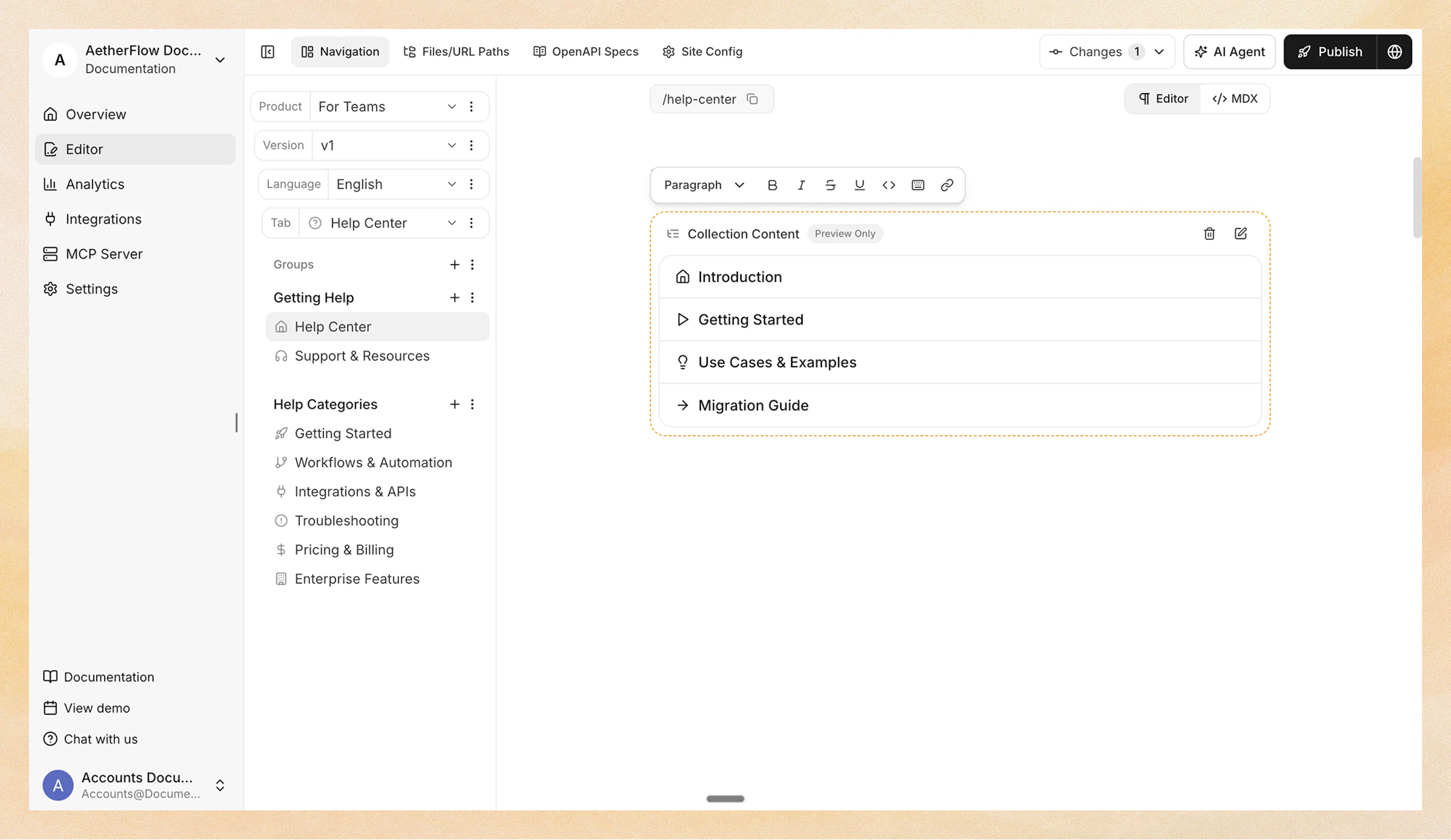
Collection Content
Reference for the CollectionContent component that displays the full nested tree under a navigation node as a collapsible accordion structure.
Overview
CollectionContent renders the full nested tree under a navigation node as a recursive, collapsible accordion. Instead of showing only direct children, it displays the complete hierarchy at all levels so readers can drill down through multiple layers of your navigation.
Use CollectionContent to:
-
Display a nested table of contents for an entire section as a collapsible tree
-
Build reference or help center pages where readers need to see everything at a glance
-
Keep navigation-driven content in sync automatically as you add or remove pages
You can add the component in two ways:
-
Web Editor – Insert from the slash menu under the Dynamic category.
-
Code Editor (MDX) – Use the
<CollectionContent>component directly.
Collection components read your live navigation structure. When you add, remove, or reorder pages in a group, the collection updates automatically on your next deploy. Because they resolve against your actual navigation tree, they cannot be previewed as static examples on this page; add one to a page in your own project to see it in action.
Understanding the node attribute
The node attribute tells the component which navigation node's full tree to display.
The node value is a path that walks your navigation tree using the format type:name, separated by / for each level. For example:
| Node path | What it targets |
|---|---|
tabs:Guides | The tab named "Guides" |
tabs:API/groups:Authentication | The "Authentication" group inside the "API" tab |
groups:Getting Started | The group named "Getting Started" |
dropdowns:Platform/tabs:REST | The "REST" tab inside the "Platform" dropdown |
The component resolves the node at render time and displays its full descendant tree.
In the Web Editor, you do not need to write the node path manually. The slash menu opens a visual navigation tree picker where you select the target node by clicking.
Using with Web Editor
-
Place your cursor on a new line.
-
Type / and search for Collection Content.
-
Select Collection Content from the Dynamic category.
-
A navigation tree picker opens. Select the target node.
-
The component is inserted. Click the edit icon to toggle the default expansion state.
Using with Code Editor
<CollectionContent node="tabs:Guides" default-expanded={false} />
Container nodes (groups, tabs, dropdowns) render as collapsible sections with a chevron. Leaf pages render as clickable links. The tree indents at each level for visual clarity.
Attribute reference
Navigation node path in type:name/type:name format. Identifies which node's full tree to display.
Whether all tree nodes start expanded. Defaults to false (collapsed).
When to use CollectionContent vs CollectionList
| Scenario | Recommended component |
|---|---|
| Landing page for a section with a few groups | CollectionList with cards layout |
| Quick navigation links in a sidebar or footer | CollectionList with links layout |
| FAQ-style browsing of a section | CollectionList with accordion layout |
| Full table of contents for a deep section | CollectionContent |
| Displaying only direct children, not nested items | CollectionList |
| Displaying the entire hierarchy at all levels | CollectionContent |
Best practices
-
Point to container nodes, not pages Collection components display children of a container (group, tab, dropdown). Pointing to a leaf page produces an empty result.
-
Keep the target section well-organized Because collections mirror your navigation structure, a clean hierarchy of groups and pages produces a clean layout. Reorganize your navigation if the collection output looks cluttered.
-
Use CollectionContent sparingly Full-tree rendering is most useful for reference sections or help centers where readers need to see everything at a glance. For most docs,
CollectionListis the better default. -
Combine with content pages on containers If your groups or tabs have content pages attached, you can use a CollectionContent on that content page to create a self-maintaining hub.