Tabs
Organize content into tabbed interfaces with optional icons and smooth animated transitions.
Overview
The Tabs component creates an interactive tabbed interface with smooth animations and optional icons.
Each tab has a title and supports any rich content, including text, code blocks, callouts, images, and other components.
You can work with Tabs in two ways:
-
Editor UI: Insert and manage tabs visually (no code required).
-
MDX: Use the
<Tabs>and<Tab>components in your source files.
Common use cases:
-
Platform-specific installation instructions
-
API examples in multiple programming languages
-
Feature documentation with different implementation options
-
Environment-specific configuration (dev, staging, prod)
-
Version-specific docs showing differences between releases
Using with Web Editor
The Web Editor lets you insert and manage Tabs visually while still generating valid MDX under the hood.
Insert a Tabs block
-
Place your cursor where you want the tabs to appear.
-
Type / to open the command menu and search for Tabs.
-
Select Tabs. A tabs block is added with two tabs created by default.
Sample tab:
This tab gives a quick summary of the topic.
You can introduce the main idea, explain what the reader will learn,
or provide a short description to set the context.
Use this tab to go deeper into the content.
Add explanations, examples, images, or any supporting information
that helps the reader understand the topic more clearly.
Prefer writing in code?
You can switch to MDX view inside the Web Editor to write or edit this component using the same syntax as the Code Editor. This is useful if you want full control while staying in the Web Editor.
Edit tab content
-
Title: Double-click the tab label you want to edit.
-
Content: Start typing in the content area below the tabs. You can add any rich content: text, lists, images, code blocks, images, callouts, cards, etc.
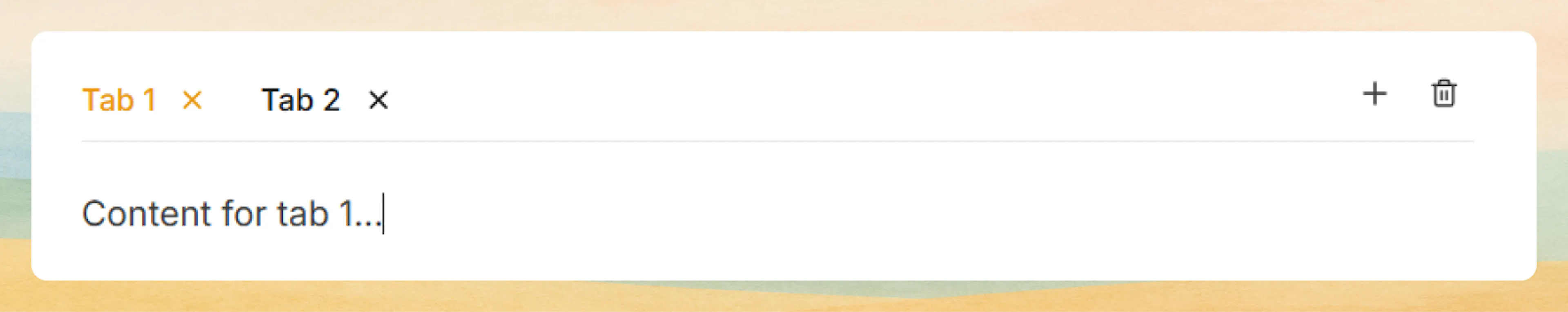
Manage tabs
-
Add a tab: Click the + button on the right side of the tab bar.
-
Remove a tab: Click the X icon on the tab you want to delete.
-
Rename a tab: Double-click the tab’s name and type a new label.
Tabs created in the editor UI map directly to <Tabs> and <Tab> components in MDX.
In the editor UI, you add icons to tabs by asking the AI Agent in the editor to “add icons to each tab,” and it will update the Tabs block for you.
Prefer to do it yourself? You can add it through the MDX.
Using with Code Editor
You can define Tabs directly in your MDX files using the <Tabs> and <Tab> components.
<Tabs>
  <Tab title="macOS" icon="apple">
    Install using Homebrew for the best experience on macOS.

    ```bash
    brew install documentation-ai
    ```
  </Tab>
  <Tab title="Windows" icon="monitor">
    Download and run the Windows installer from the releases page.

    ```bash
    winget install documentation-ai
    ```
  </Tab>
  <Tab title="Linux" icon="terminal">
    Use your package manager or download the binary directly.

    ```bash
    sudo apt install documentation-ai
    ```
  </Tab>
</Tabs>
Install using Homebrew for the best experience on macOS.
brew install documentation-ai
Download and run the Windows installer from the releases page.
winget install documentation-ai
Use your package manager or download the binary directly.
sudo apt install documentation-ai
Basic syntax
Use the <Tabs> component as a container with individual <Tab> components for each section:
<Tabs>
  <Tab title="JavaScript">
    Content for JavaScript tab
  </Tab>
  <Tab title="Python">
    Content for Python tab
  </Tab>
</Tabs>
Content for JavaScript tab
Content for Python tab
Tab icons
Add visual context to tabs using Lucide icons for better recognition:
<Tabs>
  <Tab title="Overview" icon="book-open">
    Get started with the fundamentals of DocumentationAI and learn core concepts.
  </Tab>
  <Tab title="Installation" icon="download">
    Follow step-by-step instructions to install and configure your environment.
  </Tab>
  <Tab title="Configuration" icon="settings">
    Customize your setup with advanced configuration options and best practices.
  </Tab>
  <Tab title="Deployment" icon="rocket">
    Deploy your documentation to production with automated CI/CD workflows.
  </Tab>
</Tabs>
Get started with the fundamentals of DocumentationAI and learn core concepts.
Follow step-by-step instructions to install and configure your environment.
Customize your setup with advanced configuration options and best practices.
Deploy your documentation to production with automated CI/CD workflows.
Icon names use the Lucide icon library. Reference the Lucide icon directory for all available options.
Rich content support
Tabs support any MDX content, including nested components, callouts, images, and complex layouts:
<Tabs>
  <Tab title="Quick Start" icon="zap">
    Get up and running in under 5 minutes with our streamlined setup process.

    <Callout kind="success">
      All dependencies are automatically installed and configured for you.
    </Callout>

    ```bash
    npm create documentation-ai@latest
    cd my-docs
    npm run dev
    ```
  </Tab>
  <Tab title="Manual Setup" icon="wrench">
    For advanced users who want full control over their configuration.

    <Steps>
      <Step title="Create project directory" icon="folder">
        Set up your project structure and initialize package.json.
      </Step>
      <Step title="Install dependencies" icon="package">
        Add DocumentationAI and required peer dependencies.
      </Step>
      <Step title="Configure settings" icon="settings">
        Create your documentation.json configuration file.
      </Step>
    </Steps>

    <Callout kind="alert">
      Manual setup requires Node.js 18 or higher and npm 8 or higher.
    </Callout>
  </Tab>
  <Tab title="Migration" icon="move">
    Migrate from existing documentation platforms to DocumentationAI.

    Supported migration sources:
    - GitBook documentation
    - Docusaurus sites
    - ReadTheDocs projects
    - Custom static sites

    <Callout kind="info">
      Contact our migration team for assistance with large-scale projects.
    </Callout>
  </Tab>
</Tabs>
Get up and running in under 5 minutes with our streamlined setup process.
All dependencies are automatically installed and configured for you.
npm create documentation-ai@latest
cd my-docs
npm run dev
For advanced users who want full control over their configuration.
Create project directory
Set up your project structure and initialize package.json.
Install dependencies
Add DocumentationAI and required peer dependencies.
Configure settings
Create your documentation.json configuration file.
Manual setup requires Node.js 18 or higher and npm 8 or higher.
Migrate from existing documentation platforms to DocumentationAI.
Supported migration sources:
-
GitBook documentation
-
Docusaurus sites
-
ReadTheDocs projects
-
Custom static sites
Contact our migration team for assistance with large-scale projects.
Advanced options
Platform-specific instructions
Create platform-specific guides that adapt to your users' operating systems:
<Tabs>
  <Tab title="npm" icon="package">
    ```bash
    npm install @documentation-ai/sdk
    npm install --save-dev @documentation-ai/cli
    ```

    Add scripts to your package.json:

    ```json
    {
      "scripts": {
        "docs:dev": "doc-ai dev",
        "docs:build": "doc-ai build",
        "docs:deploy": "doc-ai deploy"
      }
    }
    ```
  </Tab>
  <Tab title="pnpm" icon="package">
    ```bash
    pnpm add @documentation-ai/sdk
    pnpm add -D @documentation-ai/cli
    ```

    Add scripts to your package.json:

    ```json
    {
      "scripts": {
        "docs:dev": "doc-ai dev",
        "docs:build": "doc-ai build",
        "docs:deploy": "doc-ai deploy"
      }
    }
    ```
  </Tab>
  <Tab title="Yarn" icon="package">
    ```bash
    yarn add @documentation-ai/sdk
    yarn add --dev @documentation-ai/cli
    ```

    Add scripts to your package.json:

    ```json
    {
      "scripts": {
        "docs:dev": "doc-ai dev",
        "docs:build": "doc-ai build",
        "docs:deploy": "doc-ai deploy"
      }
    }
    ```
  </Tab>
</Tabs>
npm install @documentation-ai/sdk
npm install --save-dev @documentation-ai/cli
Add scripts to your package.json:
{
  "scripts": {
    "docs:dev": "doc-ai dev",
    "docs:build": "doc-ai build",
    "docs:deploy": "doc-ai deploy"
  }
}
pnpm add @documentation-ai/sdk
pnpm add -D @documentation-ai/cli
Add scripts to your package.json:
{
  "scripts": {
    "docs:dev": "doc-ai dev",
    "docs:build": "doc-ai build",
    "docs:deploy": "doc-ai deploy"
  }
}
yarn add @documentation-ai/sdk
yarn add --dev @documentation-ai/cli
Add scripts to your package.json:
{
  "scripts": {
    "docs:dev": "doc-ai dev",
    "docs:build": "doc-ai build",
    "docs:deploy": "doc-ai deploy"
  }
}
Attributes
Tabs component
The <Tabs> component acts as a container and has no configurable attributes. It automatically manages tab state and animations.
Tab component
The tab label displayed in the navigation bar. This text identifies each tab and should be concise and descriptive.
Optional Lucide icon name to display alongside the tab title. Enhances visual recognition and improves user experience. Reference Lucide icons for available options.
The content displayed when the tab is active. Supports all MDX content including text, code blocks, callouts, images, lists, tables, and other components.
Common patterns
-
Multi-language code samples: JavaScript, Python, Go, cURL, etc.
-
Platform guides: Windows, macOS, Linux install instructions.
-
Framework integrations: React, Vue, Angular, Svelte in separate tabs.
-
Environment configs: Dev, staging, production settings.
-
Version notes: v1, v2, v3 differences and migration tips.
Tabs include an animated underline indicator that moves with the active tab, giving users clear visual feedback about which content they’re viewing.