Columns
Reference for creating responsive grid layouts using the Columns component.
Overview
Use the Columns component to create responsive multi-column layouts in your docs. It is most often used to:
-
Arrange Card grids for feature or navigation sections
-
Place images side by side using Images
-
Split content into two or more columns for comparisons or dense link lists
-
Combine Cards, Images, Callouts, and other components in a single grid
Columns is a layout wrapper only. It does not change the content itself; it controls how child components are placed across the page and how they respond to different screen sizes.
Responsive
Automatically adapts to mobile, tablet, and desktop screens.
Flexible
Support for 2, 3, or 4 column layouts.
Consistent
Maintains consistent spacing between items.
Using with Web Editor
In the Web Editor, there are two main ways to create multi-column layouts:
-
Card Group (visual, card-only grids)
-
MDX view with Columns (fully flexible mixed content)
Card Group (visual editor)
Use Card Group when you want a simple grid of navigation or feature cards:
-
Open a page in the Web Editor.
-
Insert a Card Group block.
-
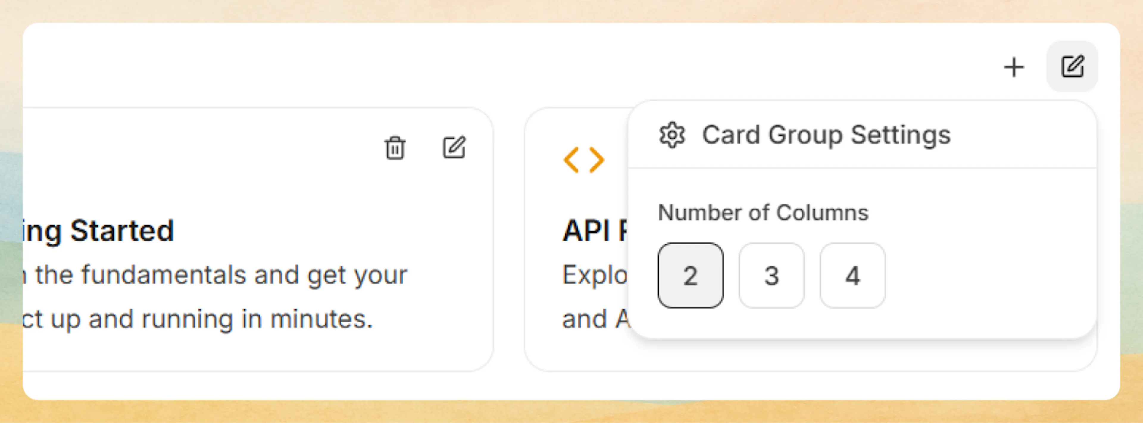
Configure columns: Open Card Group Settings from the group’s three-dot menu and choose 2, 3, or 4 columns.
This is the quickest way to build feature or navigation grids using Card without writing code.
MDX view with Columns (mixed content)
When you need more control or want to mix Cards, Images, Callouts, and text in a single grid, switch the Web Editor into MDX view and use the Columns component directly.
Prefer writing in code?
You can switch to MDX view inside the Web Editor to write or edit this component using the same syntax as the Code Editor. This is useful if you want full control while staying in the Web Editor.
A simple example using Cards:
Get started
Learn the core concepts and how Documentation.AI is structured.
Write docs
Author and maintain documentation using MDX in your codebase.
Add media
Use images and screenshots to clarify long or complex flows.
<Columns cols={3}>
  <Card title="Get started" icon="book-open" href="/getting-started/introduction">
    Learn the core concepts and how Documentation.AI is structured.
  </Card>
  <Card title="Write docs" icon="code" href="/write-and-publish/code-editor">
    Author and maintain documentation using MDX in your codebase.
  </Card>
  <Card title="Add media" icon="image" href="/components/images">
    Use images and screenshots to clarify long or complex flows.
  </Card>
</Columns>
Using with Code Editor
In the Code Editor (or any MDX file in your repository), you can import and use Columns directly.
Basic syntax
Wrap any components in <Columns> to create a grid layout:
<Columns cols={2}>
  <Card title="First Item" icon="circle" href="#">
    Content for the first column.
  </Card>
  <Card title="Second Item" icon="square" href="#">
    Content for the second column.
  </Card>
</Columns>
Column configurations
Two columns:
Perfect for side-by-side comparisons or paired content:
<Columns cols={2}>
  <Card title="Before" icon="circle-x" href="#">
    Original implementation with manual configuration.
  </Card>
  <Card title="After" icon="check-circle" href="#">
    Simplified approach using our automated tools.
  </Card>
</Columns>
Before
Original implementation with manual configuration.
After
Simplified approach using our automated tools.
Three columns:
Ideal for feature showcases or grouped information:
<Columns cols={3}>
  <Card title="Fast" icon="zap" href="#">
    Optimized for performance and speed.
  </Card>
  <Card title="Secure" icon="shield" href="#">
    Built with security best practices.
  </Card>
  <Card title="Scalable" icon="trending-up" href="#">
    Grows with your application needs.
  </Card>
</Columns>
Fast
Optimized for performance and speed.
Secure
Built with security best practices.
Scalable
Grows with your application needs.
Four columns:
Great for extensive feature lists or navigation grids:
<Columns cols={4}>
  <Card title="Docs" icon="book-open" href="#">
    Read the documentation.
  </Card>
  <Card title="API" icon="code" href="#">
    Explore the API reference.
  </Card>
  <Card title="Support" icon="help-circle" href="#">
    Get help from our team.
  </Card>
  <Card title="Community" icon="users" href="#">
    Join the community.
  </Card>
</Columns>
Docs
Read the documentation.
API
Explore the API reference.
Support
Get help from our team.
Community
Join the community.
Use horizontal cards with 4 columns for better content fit on desktop screens.
Mixed-content example
Columns is not limited to Cards. You can mix text, Images, Callouts, and other components in the same grid.
<Columns cols={2}>
  <div>
    ### First Section
    Regular markdown content in the first column.
  </div>

  <div>
    ### Second Section
    More content in the second column with **formatting**.
  </div>
</Columns>
With Images:
<Columns cols={3}>
  <Image src="./image1.jpg" alt="First" width="300" height="200" />
  <Image src="./image2.jpg" alt="Second" width="300" height="200" />
  <Image src="./image3.jpg" alt="Third" width="300" height="200" />
</Columns>
With Callouts:
<Columns cols={2}>
  <Callout kind="info">
    This is an informational callout in the first column.
  </Callout>
  <Callout kind="tip">
    This is a tip callout in the second column.
  </Callout>
</Columns>
You can also place Columns inside other sections of a page, as long as it is used at the block level and wraps valid MDX content or components.
Advanced options
Responsive behavior
Columns automatically adapts to screen size:
-
On mobile, content stacks into a single column for readability.
-
On tablet, layouts typically show 2 columns (for
cols={2},cols={3}, orcols={4}). -
On desktop, the full number of columns specified by
colsis used (up to the configured limit).
| Screen Size | cols={2} | cols={3} | cols={4} |
|---|---|---|---|
| Mobile | 1 column | 1 column | 1 column |
| Tablet | 2 columns | 2 columns | 2 columns |
| Desktop | 2 columns | 3 columns | 4 columns |
This means you can safely use cols={3} or cols={4} without breaking mobile layouts; items will stack in a logical reading order (left to right, top to bottom).
Layout and content best practices
-
Prefer 2 columns for text-heavy content or detailed comparisons.
-
Use 3 columns for most feature or navigation grids.
-
Use 4–5 columns only for short labels or icon-based content.
-
Keep titles and descriptions similar in length across columns so the grid feels balanced.
-
Avoid placing large blocks of unstructured text in more than 2 columns; instead, use headings, lists, or Cards to break it up.
-
Test key pages at mobile and tablet sizes to confirm that stacked content remains clear and in a sensible reading order.