Views
Understand views (tabs and dropdowns), how they relate to dimensions and content, and how to choose and manage navigation patterns in the Web Editor.
Overview
Views control how content is organized and navigated within a Dimension context in Documentation.AI.
-
Dimensions decide which content is in scope (for example, product, audience, or version).
-
Views decide how that scoped content appears in the UI (Tabs, Sidebar Dropdowns, and how they nest).
-
Content items (Groups, Pages, Page Groups, OpenAPI References) live inside Views to form your navigation tree.
You work with views in two places:
-
In the Web Editor, when you organize navigation for a project.
-
In site configuration, when you define views and patterns programmatically (see Site configuration).
This page focuses on:
-
The conceptual model and reference rules for views.
-
A Web Editor–focused workflow for adding and organizing tabs and dropdowns.
Think of a dimension as a filter on content, and a view as the layout for navigating that filtered content.
Supported view types
Documentation.AI supports two view types at the layout layer:
-
Tabs: horizontal, top-level navigation areas.
-
Dropdowns: collapsible sidebar categories.
Both types act as containers for content or other containers.
Tabs
Tabs are top-level navigation sections such as Guides, API Reference, or Changelog.
Use Tabs when:
-
You have 2–5 major sections readers switch between often.
-
Each section needs its own navigation branch.
-
You want clear separation between content types (Guides vs API) or audiences (Developers vs Admins).
What Tabs do:Switching Tabs changes the active navigation branch and typically changes what appears in the sidebar.
You will often see tabs used in patterns like:
-
Guides | API Reference | Changelog -
Developers | Admins
Dropdowns
Dropdowns are collapsible sidebar categories such as Getting Started, Integrations, or SDKs.
Use Dropdowns when:
-
The sidebar is long and needs clear categories.
-
You need hierarchy inside a section.
-
You want readers to drill down through categories.
What Dropdowns do:
-
A Dropdown is a container: it reveals child items when expanded.
-
Dropdowns can nest, but keep nesting shallow in most docs.
In practice, your main sidebar will often be composed of dropdowns with groups and pages inside.
Two starting states: with Dimensions vs without Dimensions
Your project can be organized in either of these ways:
-
With Dimensions: you first select a Dimension value (for example, Version: v1.0), then build Views inside it.
-
Without Dimensions: there is only one global navigation tree, and you build Views directly at the root.
The Editor supports both. The steps for adding Views change slightly depending on which starting state you’re in.
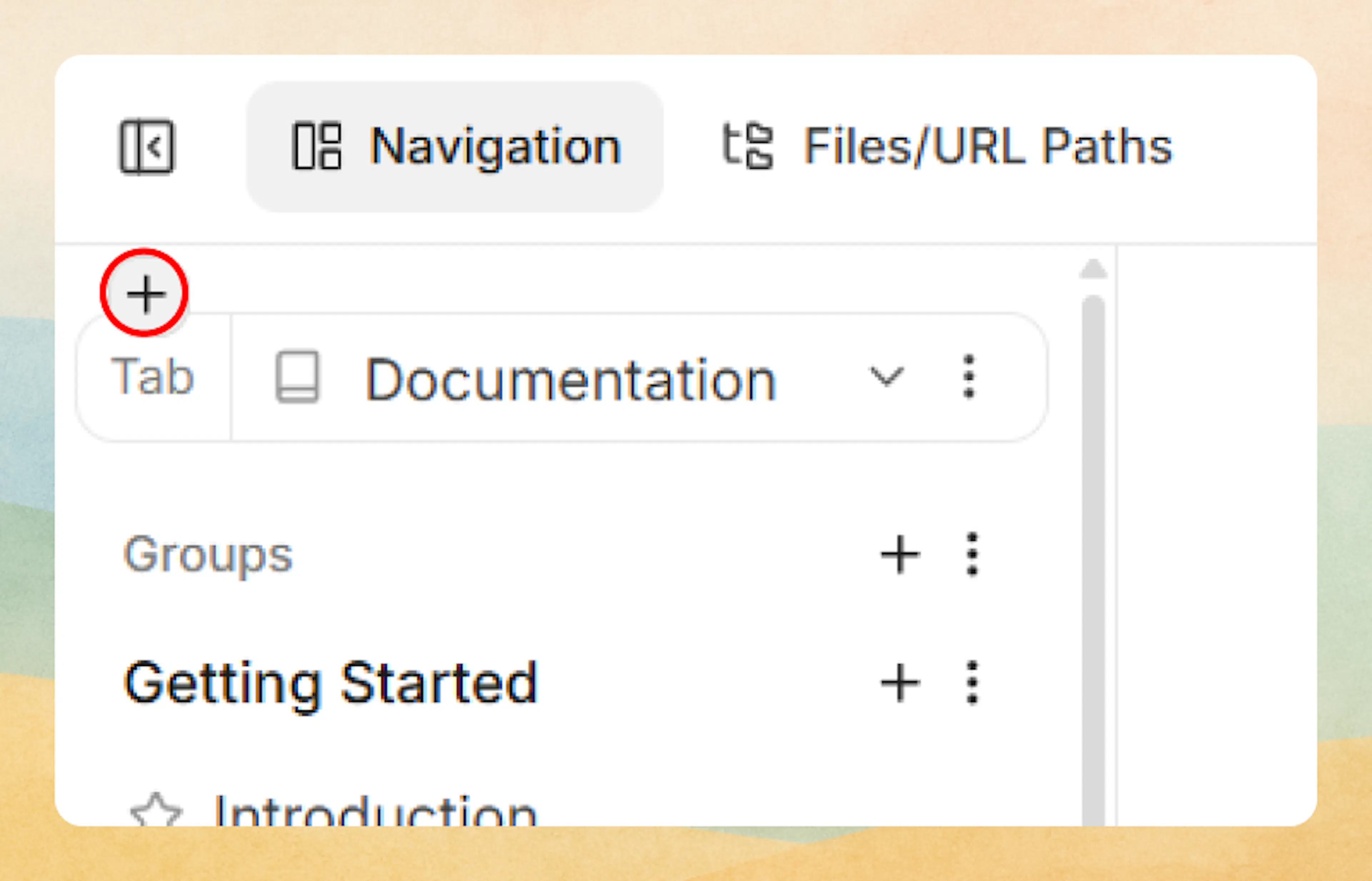
Working with Views in the Web Editor
Before you start: choose the correct branch
-
Open Editor → Navigation.
-
If you see Product/Version/Language selectors, your project has Dimensions. If you don’t, you’re editing a single global navigation tree (no Dimensions).
-
Confirm you’re editing the right branch by switching the available selectors and verifying the navigation tree changes as expected.
How layering works (Parent vs Child)
-
Add Parent layer (top “+”): wraps the current level in a new container and moves existing items under it. Use when you want to restructure everything at that level.
-
Add Child layer (bottom/inline “+”): adds a new container only inside the selected item. Use when you want to restructure only that section.
-
Layers can wrap Views or Content, but Views can’t be added above Dimensions.
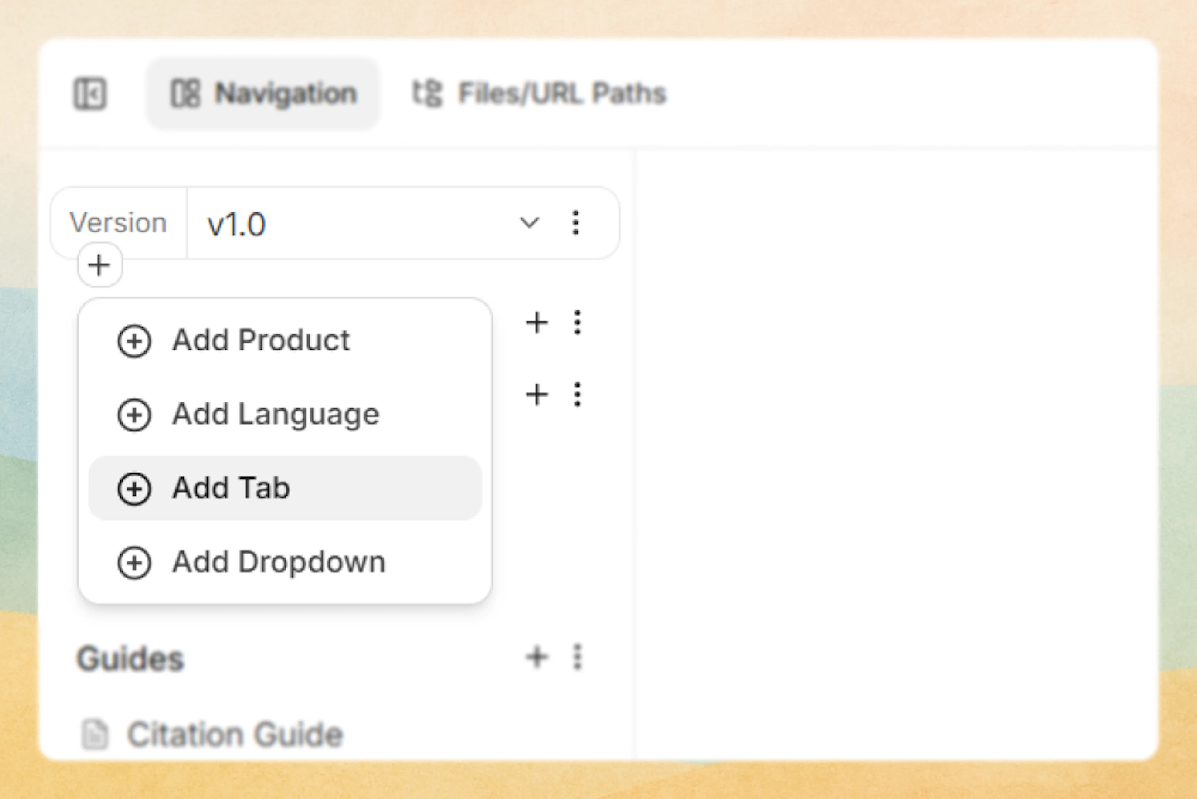
Scenario 1: Add Views when your project has Dimensions
1) Select the correct Dimension branch:
-
Open the Editor and go to the Navigation panel.
-
Select the Dimension value you want to edit (for example, Version: v1.0).
-
Confirm you’re in the right branch by switching Dimension values and verifying the sidebar content changes.
You always add Views inside the selected Dimension branch.
2) Add Tabs or Dropdowns using layers:
-
Use Add Parent layer (top-level +) when you want to wrap the current level and introduce a new container above it (for example, adding another view above existing tabs).
Adding a parent layer 'view' -
Use Add Child layer (bottom +) when you only want to add structure inside the selected item (for example, a new tab inside a version).
Adding a child layer 'view'
Then choose either Add Tabs or Add Dropdowns.
3) Name and add sibling Views
-
Name the first tab/dropdown item clearly.
-
The Editor moves your existing content under the new View layer automatically.
-
Add more sibling tabs/dropdowns at the same level (for example, add “API Reference” after “Guides”).
4) Confirm placement
-
Switch between tabs/dropdowns and confirm you see the expected content under each.
-
If content moved unexpectedly, you likely used Parent where you intended Child (or vice versa).
Scenario 2: Add Views when your project has no Dimensions
When there are no Dimensions, you are editing a single global navigation tree. Views are added directly at the root (or inside any existing View).
-
** Start at the root navigation**
-
Open the Editor and go to the Navigation panel.
-
If you do not see any Dimension selectors, your project is using no Dimensions.
-
The structure you see is the root navigation tree for the entire site.
-
-
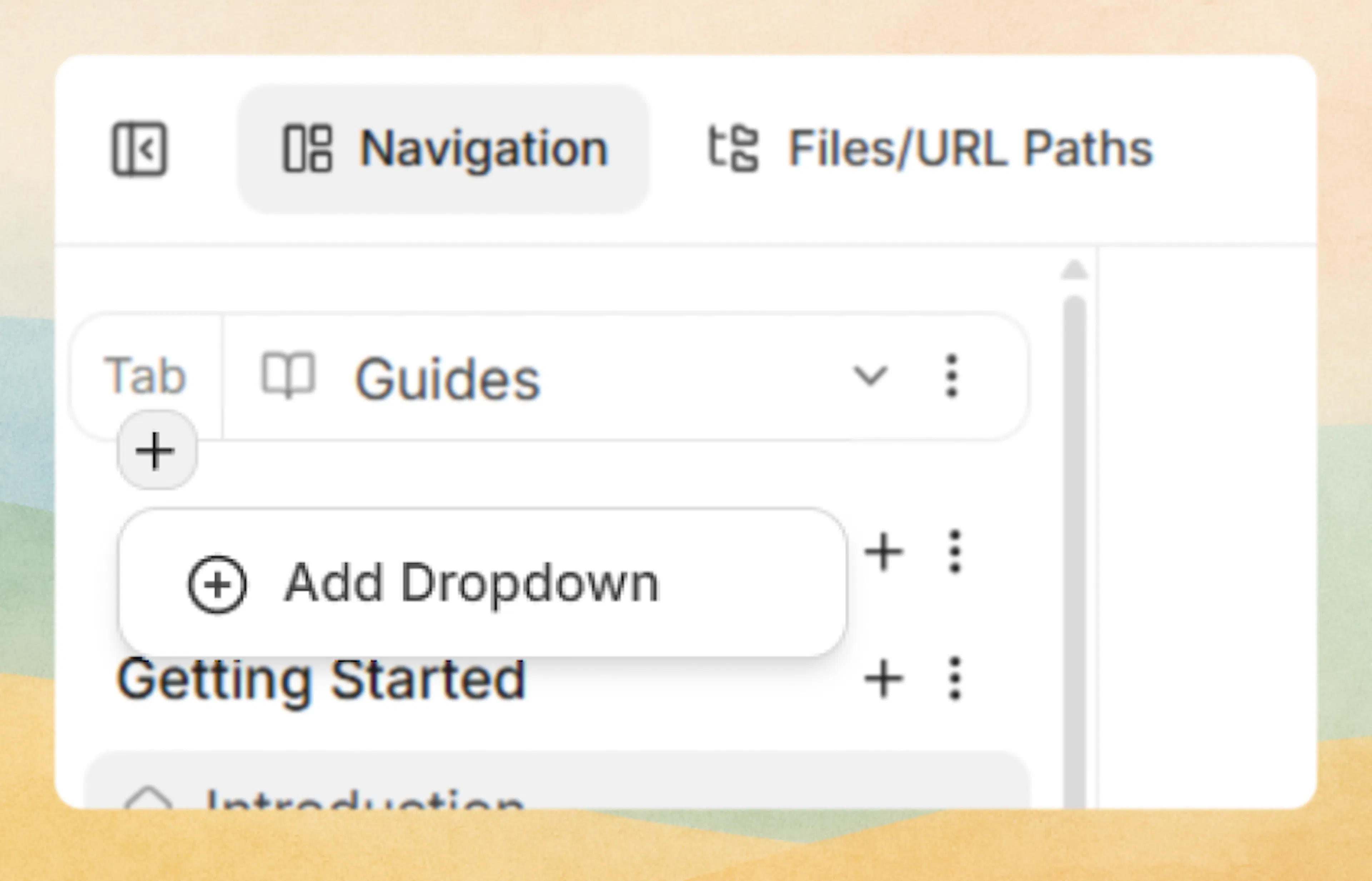
Introduce Views at the root (recommended)
This is the safest way to add structure after you already have pages.-
Use Add Parent layer at the root level:
Hover on the top area above the Groups/Pages Section heading and click Add Parent layer (top+) to wrap the existing root content.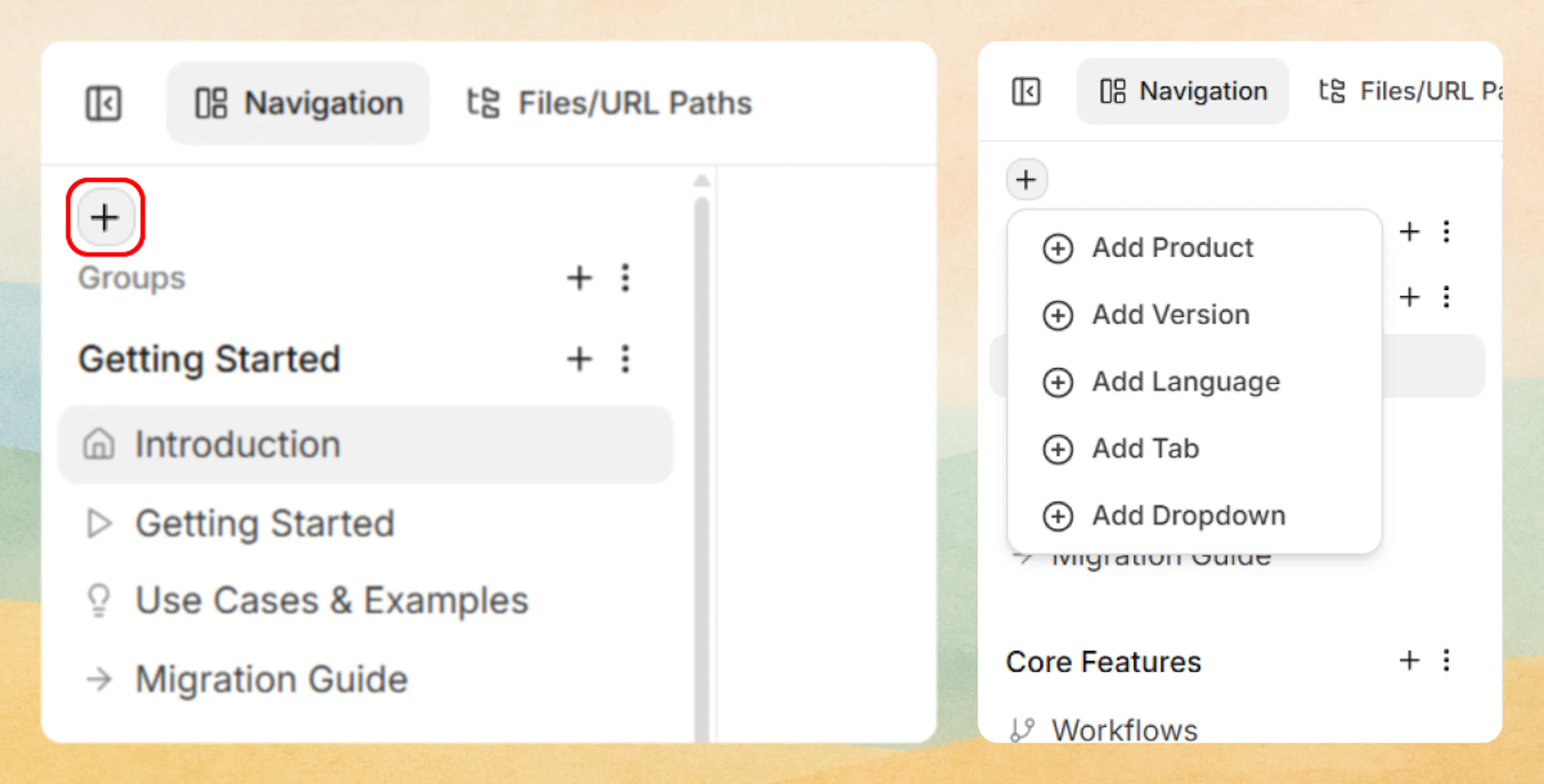
Adding 'view' in flat document structure -
Choose Add Tabs or Add Dropdowns to add Views.
-
Enter the first tab or dropdown name and create sibling items.
-
-
Validate:Switch between newly created tabs/dropdowns and confirm content is split as intended.
Adding Views inside existing Views (nested Views)
Once a View exists, you can add another View underneath it, as long as the one-child rule is respected.
Common examples:
-
Add Dropdowns under a Tab to create sidebar categories.
-
Nest Dropdowns inside a Dropdown for sub-categories.
-
Add Tabs inside a Dropdown only if your intended pattern supports it (Dropdown → Tabs → Dropdown).
If an “Add Tabs” or “Add Dropdowns” option is missing:
-
It usually means adding it there would violate the one-child rule.
-
Fix by wrapping content using Add Parent layer, or by moving items into a container that already uses the child type you need.
How Views connect to Groups and Pages in the sidebar
After you select a branch (for example: Version: v1.0 → Tab: Guides → Dropdown: Integrations), the sidebar will show the content level for that branch:
-
If that branch uses Groups, you’ll see a Groups section and add pages inside a group.
-
If that branch is flat, you’ll see a Pages section and add pages at the top level.
Views determine where you are in the navigation tree. Groups/Pages determine what content exists inside that branch.
Core rules for Views
These rules explain how Views work and why the Web Editor shows (or hides) certain actions.
1) Views never contain Dimensions
Dimensions (when used) are always the outermost layer of the navigation tree.
-
You can add a View as a parent for another View or for Content.
-
You cannot add a View as a parent for Dimensions.
If you need Product/Version/Language selectors, add a Dimension layer first. Then add Views inside each dimension branch.
2) The one-child rule
Every container can contain exactly one child type.
-
A Tab can contain only one of: Pages, Groups, or Dropdowns.
-
A Dropdown can contain only one of: Pages, Groups, Tabs, or Dropdowns.
You cannot mix child types at the same level (for example, a dropdown cannot contain both Pages and Dropdowns as siblings).
This is why the Web Editor hides “Add …” options at certain levels—it only shows actions that keep the tree valid.
3) Common supported nesting patterns
The standard UI templates support these patterns between tabs and dropdowns:
| Pattern | Structure | Typical use case |
|---|---|---|
| Pattern 1 | Dropdown → Tabs → Dropdown | Complex, category-first navigation with sub-sections |
| Pattern 2 | Dropdown → Dropdown | Pure hierarchical sidebar without horizontal tabs |
| Pattern 3 | Tabs → Dropdown → Dropdown | Tabbed sections each with their own nested categories |
In each pattern:
-
Tabs and dropdowns act as the layout containers.
-
Groups and pages are the leaf-level content or light-weight containers under those views.
How views relate to dimensions, groups, and pages
To design navigation that scales, it helps to keep the layering clear:
-
Dimension
-
Defines a scope such as
Product,Version, orAudience. -
Within each dimension context, you define views.
-
-
Views (tabs, dropdowns)
-
Control layout and interaction patterns inside that dimension.
-
Determine whether users first choose between top-level sections (tabs) or drill down categories (dropdowns).
-
-
Groups and pages
-
Represent actual documentation content and sections.
-
Are placed beneath views according to the one-child rule.
-
A common pattern for a dimension might look like:
-
Tabs:
Guides | API Reference-
Each tab has:
-
Sidebar dropdowns like
Getting Started,Tutorials,Integration Guides. -
Groups/pages inside each dropdown.
-
-
When designing across multiple dimensions, try to keep view patterns consistent so users do not have to relearn navigation for each context.
Content pages on views
By default, tabs and dropdowns are purely structural — they organize content but do not have pages of their own. Clicking a tab switches the navigation branch; clicking a dropdown expands it.
You can attach a content page to any tab or dropdown. This gives the view its own MDX-backed page with a unique path.
When to attach a content page to a view
- Tab landing pages – Give each tab an overview page that introduces its section. For example, an "API" tab could have a content page that explains your API architecture before readers drill into specific endpoints.
- Dropdown hub pages – A dropdown for "Integrations" could have a content page listing supported integrations with a CollectionList component.
- Breadcrumb navigation – When a view has a content page, it appears as a clickable link in the breadcrumb trail, helping readers orient themselves in deep navigation hierarchies.
Content pages on views are optional. Most tabs and dropdowns work fine without one. Add a content page when readers would benefit from an entry point or overview for the section.
Add a content page in the Web Editor
- In the editor sidebar, click the menu icon next to the tab or dropdown name.
- Select Attach Content Page.
- Enter a path (slug) for the page, or browse unpublished pages to reuse an existing MDX file.
- The view now opens its content page when clicked. Write your content or add Collection components.
Add a content page in configuration
Add a path property to the tab or dropdown entry in documentation.json:
{
  "tab": "API Reference",
  "icon": "code",
  "path": "api/overview",
  "groups": [
    {
      "group": "REST API",
      "pages": [
        { "title": "Authentication", "path": "api/authentication" },
        { "title": "Endpoints", "path": "api/endpoints" }
      ]
    }
  ]
}
The same approach works for dropdowns:
{
  "dropdown": "Platform",
  "icon": "server",
  "path": "platform/overview",
  "tabs": [...]
}
How content pages affect view behavior
- The view label in the navbar or sidebar becomes a navigable link to the content page.
- Switching between tabs still changes the active navigation branch as before.
- The content page appears in breadcrumb navigation, search results, and AI features.
- Access control settings on the view are inherited by its content page.
Display options
Content pages on views support the same display options as regular pages: badge, show-sidebar, show-toc, show-parent-label, content-width, show-page-navigation, and ask-feedback. You can also set method and tags for API-oriented views. See Page Configuration for the full list.
Detach a content page
In the Web Editor, open the view settings and click Detach Content Page. In configuration, remove the path property. The MDX file remains as an unpublished page.
Design guidelines and common patterns
When to use tabs vs dropdowns
Use tabs when:
-
You need clear, top-level separation between modes, audiences, or content types.
-
You have 2–5 major sections that users should be able to switch between quickly.
-
You want the sidebar structure to reset depending on the active section.
Use dropdowns when:
-
You are organizing related content within a single section or tab.
-
The sidebar is long enough that scannability becomes an issue.
-
You need 2–3 levels of hierarchy for complex topics (for example, deep API reference structures).
If you are unsure, default to:
-
A small number of tabs at the top level.
-
Dropdowns in the sidebar under each tab to group content.
Choosing a nesting pattern
Use these heuristic patterns:
-
Pattern 1:****
Dropdown → Tabs → Dropdown
Use when:-
Users first choose a high-level area in the sidebar (like
Product AvsProduct B). -
Inside that area, they need multiple parallel sections exposed as tabs.
-
Each tab then has its own dropdown-based sidebar.
-
-
Pattern 2:
Dropdown → Dropdown
Use when:-
Your project is small or focused enough that tabs are not necessary.
-
You want a single continuous sidebar with hierarchical categories.
-
-
Pattern 3:
Tabs → Dropdown → Dropdown
Good default for most medium-to-large documentation sets:-
Tabs separate high-level sections.
-
The first level of dropdowns groups major categories.
-
A second dropdown level is available for large categories (for example, many APIs).
-
Consistency and maintenance tips
-
Align across dimensions
If you have aVersiondimension, for example, keep the tab labels and dropdown structure consistent across versions to reduce cognitive load. -
Minimize depth
Even though dropdowns can nest, prefer no more than two dropdown levels deep in most projects. Beyond that, content is often better split into an additional tab or dimension. -
Name views by user intent
Use labels that match how readers think:-
Prefer
Getting StartedoverOnboarding Docs. -
Prefer
API ReferenceoverBackend.
-
-
Plan before implementing
Sketch your dimension, view, and content hierarchy before editing navigation:-
What dimensions exist?
-
Which tabs are required in each dimension?
-
How will dropdowns group content inside each tab?
-
For concrete field names and configuration examples, see:
-
Dimensions for how dimension selectors define context.
-
Site configuration for JSON configuration patterns of views, tabs, and dropdowns.